By Mary Farrow
Denver Newsroom, Oct 15, 2020 / 02:25 am
Michael Stevens and Nicolas Fredrickson are good friends who meet weekly for Bible study.
While they liked studying the contents of the Bible, they were less than impressed with the design and materials of the physical Bibles they were using.
"The modern Catholic Bibles...were unfortunately all made of cheap materials," Fredrickson said. "Even my 'leather' Bible started peeling and falling apart after a few years. Granted I used it heavily, but I certainly couldn't pass it down to my children in good condition."
Fredrickson started collecting Bibles to compare different translations and commentaries. He discovered a whole world of "premium" Bibles, made of the highest quality materials - but they were all Protestant versions.
Stevens shared his frustrations, and the two began brainstorming what it would take to produce a quality Catholic Bible. It helps that Fredrickson is a skilled typographer, and Stevens a graphic designer.
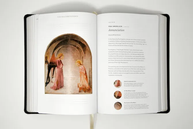
"We settled on the idea of a 'Bible of beauty': a Bible that would rekindle an awareness and appreciation for the Church's vast tradition of sacred art, architecture, and design. This meant looking to medieval illuminated manuscripts for inspiration, studying the visual symbology of the Gospels, and even including high-quality reproductions of some of the major treasures of Catholic art history," Stevens said.
But by that point, they still had no idea how they would have the resources to create such a high quality product, or where they would get the theological commentary that they also wanted to include.
"We simply trusted that if it was meant to be, we would figure out a way to either fund it ourselves or pitch it to a publisher," Stevens said.
Little did they know, Word on Fire - the media ministry founded by Bishop Robert Barron - was already working on this exact project, and needed some graphic designers to help.
They "cold e-mailed" Word on Fire to pitch their idea. They had long been fans of the Word on Fire podcast, and Barron's evangelistic philosophy of "leading with beauty" had been inspirational to them in their quest to design a new Bible.
"Within a few days, we were astonished at Word on Fire's response. Not only did they like our idea, they told us they were just finishing the manuscript for their own multi-volume edition of the Bible and looking for graphic designers to assist in the creative process. The copy would be ready for layout in a few weeks: just enough time to bring us up to speed on the project and decide on a final creative direction if we were interested in joining forces," Stevens said.
"We truly couldn't believe our eyes as we read. We could have never imagined a more perfect scenario," he added.
Brandon Vogt is the senior content director at Word on Fire. He told CNA that the idea for a beautiful Bible that incorporated some of the art of the Church had been in the works at Word on Fire for about three years.
"To be honest, I was initially resistant" to the idea, Vogt told CNA. "I thought, 'Oh man, there's so many study Bibles out there, not just in the Catholic space, but in the Protestant world too. Why would we just create another study Bible?'"
"Our fundamental mission at Word on Fire is evangelizing the (religiously) unaffiliated, the 'nones,'" he added. "Study Bibles typically cater toward the already committed Christians that want to do a Bible study that are already into the Scriptures. So I thought - it's not really hitting our target audience. So I kind of pushed back a little bit."
But the idea stuck, and Vogt said when he was pressed to think about the potential that this Bible could have, he began to realize that it could be evangelistic in nature. He thought about how many people's first experience with the Bible is that it is difficult to read - it is typically printed in small, black and white columns on thin paper.
(Story continues below)
"We wanted to make it a feast for the eyes as much for the mind. So that was the first principle, is to lead with beauty. We wanted it to be a beautiful Bible."
Vogt said they also wanted the commentary in the Bible to be geared toward people who were reading their Bibles for the first time.
"We wanted to focus on the more basic questions of - who is God? Who is Jesus Christ? How does the Scriptures reveal God and Christ?" he said.
The third distinguishing factor of this new Bible would be that it was presented "from the heart of the Church," he said. "So we wanted to showcase the Scriptures in light of 2,000 years of saints and mystics and scholars and Bible experts."
This comes in the form of theological commentary from people like the Church fathers all the way to contemporary Catholics like G.K. Chesterton, Flannery O'Connor, or Bishop Barron, he said.
"So it's kind of a multivalent illumination of the Scriptures. You're seeing it read and interpreted through this chorus of voices from 2,000 years from the Church's history," Vogt said.
They also took as their inspiration the illuminated manuscripts from the medieval period, which were hand-written and painted copies of the Bible, usually done on animal skin pages, with gold or silver leaf detailing.
"We wanted to make it simply the most beautiful Bible ever produced for mass distribution... maybe the most beautiful Bible since the illuminated manuscripts."
One of the first tasks was to select the scriptural commentary that would be included in the first volume, Vogt said. The team scoured hundreds of books and resources and "whittled it down" to roughly 300 pieces of commentary.
Stevens took the lead on finding pieces of sacred art that would be included in the Bible, which ended up being about 10 or 11 pieces per Gospel.
"This aspect of the Bible was an absolute joy to dive into," Stevens said. "The Church's tradition of art is so vast, and so wide, and so deep. One of the main considerations here was the fact that most Catholics know very little about the artistic tradition of the Church. Even engaged, well-read Catholics are often sadly uninitiated to the many styles and movements in the history of sacred art."
Yet, he said, he also wanted to make it engaging for the more seasoned sacred art enthusiast as well. The art featured in the first volume includes works that would be recognized by most Catholics, like the dome of St. Peter's Basilica in Rome, as well as some lesser-known works.
Fredrickson did a majority of the page layout for the Bible, which included keeping the commentary on track with its correct place in the Bible. He also did much of the work on the Angelico font, a new font created specifically for the Bible.
Stevens added that there were other design choices made to add to the readability of the Bible - it is a single column instead of multiple columns, and has a grid layout which keeps the pages organized and even ensures that the type lines up on both sides of the double-sided pages.
"While this might sound dry and technical, I think it ultimately does connect very powerfully to...evangelization. As designers, we believe it's important that the design of a book reflect the true character of the text itself, whatever that character might be. In this case, we were dealing with the very Word of God, so we felt it was our duty to treat it as reverently and beautifully as we could," he said.
"The more easily the reader can navigate the book and its layouts, the more they can devote their attention to the content itself," he added.
For the printing and compilation of the physical copies of the Bible, Fredrickson suggested the company Legatoria Editoriale Giovanni Olivotto, or LEGO, a family-owned craft workshop with a history of producing high-end Bibles.
"LEGO paid attention to the details of paper choices, binding, foiling, and so on in a way that was unmatched," Fredrickson siad. "They were the masters of the industry, and if we wanted a Bible that would be an heirloom, they were the ones who would make it happen."
The Bible also presented some new challenges for LEGO, including the use of fine art in the Bible and gold accents printed on the leather cover.
"It was truly something new even for the best book producers in the world," he said. After many emails, calls, meetings, and press checks, we had the perfect combination. LEGO is just as proud of this outcome as we are."
"The purpose is not merely to transmit historical information," Bishop Barron says in one of the Bible's promotional videos, "but to facilitate an encounter with a Divine person - with Jesus."
It makes use of the Via Pulchritudinis - the "way of beauty" referenced by Pope Benedict XVI and Pope Francis, Barron says in another video.
The beauty of the entire Bible - the content, the commentary, the cover, the layout, the art - everything is meant to draw the reader into an encounter with God through its captivating beauty, he notes.
"This Bible is a Cathedral in print."
